How to create d3.js force diagrams from excel tables
In Sankey diagrams from Excel and Creating d3.js Tree diagrams the input data for these d3.js visualizations was of a specific layout. We are now going to look at a more generalized data structure, in this example, to be used as input to a d3.js force directed graph. I’ll probably go back and change the others to use this standardized structure later too. Note that, as usual, none of this stuff really works with IE. d3.js uses svg, whose Wikipedia entry talks about various svg plugins for IE. I havent tried them – if you do then let us know on the forum. Better to stick to Chrome, Firefox or Safari which support svg as standard.
Why standardized data format
As in other examples on this site, for example, Integrating Excel with Maps and Earth, I plan to get this to the stage where different kinds of visualizations can be created from the same data by just changing a parameter or two. Minimizing the data structures means I can also maximize the common code for each viz.
What is a force directed graph
Mike Bostok describes these in detail, but simply a force diagram consists of nodes and links which are positioned such that nodes with similar linkages are closer together than those that are not. In fact, unlike nodes repel each other (like similarly charged particles), and since these are dynamic, moving a node around disturbs all the others too.
Update
There is an update to this now with more options – see Adding markers to d3.js force diagrams for these new features
An Example
We are going to use this example to demonstrate how to create force directed graphs straight out of Excel without any need to prepare the data in any special way. Here’s a snip of plot of Sean Connery Films and the connections between genre and director. This was a simple iTunes query using Rest to Excel library Here is the live interactive version below
And for the browser challenged, here’s a screenshot
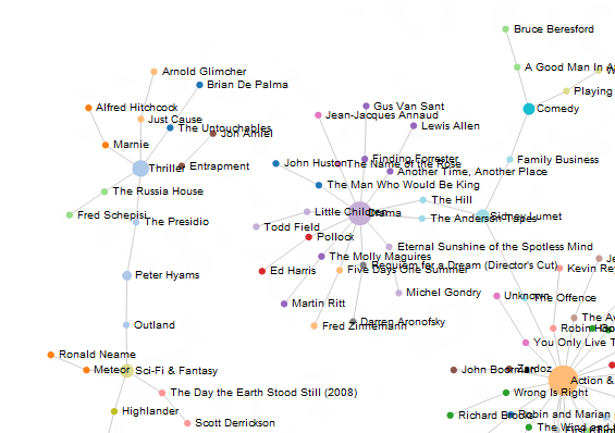 You’ll see when you move these around in the interactive version everything else moves as well.
Data
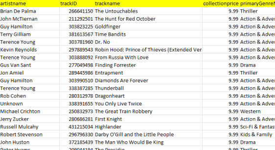
Any Excel table will do. For this example lets use the data returned from an iTunes database query on Sean Connery executed by Rest to Excel library. I use this for illustration – it can be any Excel table that you have generated in any way. Here’s a snip from the input data
Parameters
As with many other things on this site, there is a parameter worksheet which contains the code for how to do this. It also contains some user customizable parameters where you can selet the data fields you need, or tweak the diagram format. For more general information on how parameter blocks work, see How to use cDataSet.
Specifying the data columns to include in the diagram
Many of the diagrams we will create with d3.js are driven by data which is represented as a list of nodes and links. In our case, the nodes are the contents of columns, and a link will be generated between each node as you specify in your parameter. Below is the parameter block that describes the input data (identified by the fields column title) for the example.
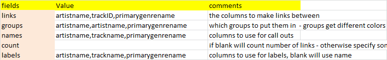
links
This is a list of the column headings of the data to include in the diagram. A link will be created between each data value in the given columns. Any column that contains a unique value for each item that is to be linked can be used.
groups
As a node (a data value), is encountered for the first time during the linking process, a group is assigned to that node. You can leave this parameter blank if you are not interested in groups. Assigning nodes to groups will cause a different color to be assigned to each group. The number of groups in the list must be 0 or the same as the number of links
names
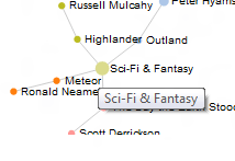
These could be the same as links – note that in our example I’ve used trackID for link and trackName for name – this is because two items could be different yet have the same name. There should be the same number of name columns as link columns. The name is displayed when you hover over a node in the diagram like this
count
During the linking process a count is kept of the number of times a node is seen. Normally this is updated by 1 for each one. Optionally this count can be used to change the size of the circle representing a node (seen a lot = bigger node than not seen much). It may be that you want to use some other characteristic. If you specify a column here, then whatever data is in that column is used to increment the count by – so you can size circles to some other characteristic such as revenue, population or whatever else you are analyzing.
labels
Labels are often the same as names. This is the value to use if you are statically naming your nodes (as in our example). The number of labels should be the same as the number of links.
Specifiying the diagram options
Many d3.js charts have a large number of options. here is the documentation, which explains them better than I would. I have exposed a few of these in this parameter block and you can tweak these through the Options parameter block which looks like this
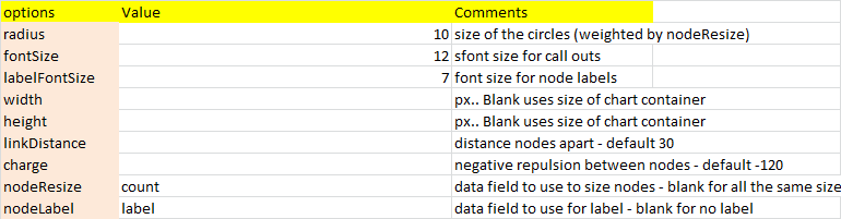
there are a few here that are not actually d3.js options, but I use to mody d3.js behavior. Here are the non-obvious ones
nodeResize
Earlier I covered the use of ‘count’ to modify the size of a circle. If this parameter is blank then all the circles will be the same size – the value specified in the radius parameter. If it says ‘count’ then it will be adjusted (according to the formula described here) using whatever you used for the count parameter earlier whilst collecting the nodes. Later on I will add mode valid selections for this parameter.
nodeLabel
If you specify ‘label’ as the value for this parameter then you will get static labels (as specificed in your labels parameter) on your chart. Leaving it blank means you get no labels. The font size will be as specified in labelFontSize. Later on I will add mode valid selections for this parameter.
How to change the layout of the generated web page
So far we have covered how to specify data to include, as well as how to affect the layout of the chart. You can also change the layout of the containing web page in the Item parameter block

When you create this chart, you will have a dependency free (aside from d3.js library and various google libraries) web page that you can run locally or put on a web site. Let’s look at tweaking the contents
titles and code
These probably don’t need to be touched unless you understand d3.js and want to change the chart behavior in some ways you cannot accomplish through options.
styles
The css code that affects the web page and chart layout are all defined here. If you are comfortable with css and styles then you can change stuff here.
body
This is the body of your web page. You are likely to want to include additional content here.
This is the title of your web page. You will probably want to retain this.
htmlName
what to call and where to put your generated html file
Warning
Some directories on your machine may be readonly to you – for example if you have downloaded this and run it from the download directory on windows 8 you may not be able to create a file in that directory because of local permission settings. You should set this to a directory you have permission to create files in.
Where is everything
The example workbook is part of the cDataSet.xlsm file which you can download here. The parameter sheet is the d3ForceParameters worksheet and the example data used here is in (or can be generated in) the ItunesMovie worksheet. The whole thing is kicked off by a command button in the ItunesMovie worksheet which runs the ‘d3forceHere’ procedure. To run on another sheet, just copy the button to where the data is.
Summary
Why not join our forum, follow the blog or follow me on twitter to ensure you get updates when they are available. in the meantime, see what else you can do with d3.js straight from Excel.
Subpages