React and Material-Ui are a great combination, but it’s not that obvious how to easily keep your Appbar in a fixed position, and adjust content to take account of it – especially if you have many pages being managed by React router. This gets further complicated when you have a left drawer that can be clicked away. In the end, it’s a very simple solution, but it just takes a bit of finding, so I thought I’d record the small steps needed to make all this happen
- so I don’t forget
- in case you’re trying to do the same (judging by the number of questions on StackOverflow it seems to be a common problem).
- if I’d known all this when I started I could have saved a few refactor loops.
The layout
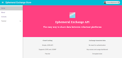
Let’s start with the App layout and how I want it to work. This is my home screen.

When I pull in the left drawer, I want the layout to automatically adjust, but if I’m on a small media (which I’ll deal with in a separate post), I want the drawer to overlap and the content not to resize. I also want the drawer to start under the Appbar, so that the hamburger icon there is still accessible.
This home screen uses absolute positioning, so it always fits the screen exactly and there’s no scrolling. However my content screens can scroll, but I also want them to adjust their content size in the same way as the home screen, and to ensure that the Appbar and drawer don’t move when scrolling.
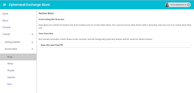
Here’s a content screen with the drawer open
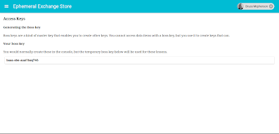
and the same screen with the drawer closed.
Recording the drawer opening and closing
I’m using redux for all my state changes, so first I connect to the part of the store that is managing this state.
@connect(store => {
  return {
    menu: store.menu
  };
})
And a toggle event is handled by dispatching an action creator that stores the latest drawer state.
// toggle the drawer
  handleToggle = () => {
    this.props.dispatch (acDrawerOpen (!this.props.menu.drawerOpen));
  };
The action creator
When a change in drawer state is detected, this action is created
export function acDrawerOpen (term = null) {

  return {
    type: cs.actions.M_DRAWER_OPEN,
    payload: term
  };

}
The reducer
This will be called in due course to record the current drawer state in the redux store
case cs.actions.M_DRAWER_OPEN: {
    return {...state,drawerOpen:action.payload};
}
Figuring out the width of the content
Now we know whether the drawer is open or closed, we can just style the content with a margin to take account of it. I’m just using the standard component widths in material UI – the drawer is 255 and the appbar is 64. I also want all content to have the same padding, so it’s just a matter of inserting margins for all content. Applying this style to each content page ensures that it resizes when the drawer is open, it starts below the Appbar, and they have a consistent margin.
// adjust for left drawer and top, with a standard padding
    // for non fixed elements.
    const pad = 16;
    const appbarHeight = 64;
    const drawerWidth = 255;

    // this will be padding (or fixed positions) depending on whethere drawer is open
    const left = this.props.menu.drawerOpen ? drawerWidth : 0;
    const top = appbarHeight;

    const width = this.props.menu.drawerOpen ?
      'calc(100% - ' +  (drawerWidth+2*pad) + 'px)' :
      'calc(100% - ' +  (2*pad) + 'px)';
    const contentWidth = this.props.menu.drawerOpen ?
      'calc(100% - ' +  drawerWidth + 'px)' :
      '100%';

    // each child will be enclosed in this style

    const contentStyle = {
      width: width,
      marginTop: top + pad,
      marginLeft: left + pad,
      marginBottom: pad,
      marginRight: pad,
      padding:0
    };
Creating a wrapper.
Each page in the site needs
- An Appbar/nav
- A drawer
- It’s content
- The dynamic styling to take account of the drawer being open
I don’t really want to repeat all that for each content page, and neither do I want to connect to the store just to see if the drawer is open. In React it’s really easy to enclose components in wrapper components, so if I apply a wrapper with all this logic in it to the page content component, and style the page component’s container as above, then each page can be very concisely created. Here’s an example content page – they all look exactly the same aside from their page component name.
export default class extends React.Component {
  render() {

    return (
        <MenuWrapper>
            <AboutArticles />
        </MenuWrapper>
    );
  }
}
The home page is a little different as it uses absolute positioning, so the styling for content won’t work. Its page component looks like this. Notice there is an additional property, fixed. This is going to be used by the wrapper class to know that this component has to be dealt with differently.
export default class Home extends React.Component {
  render() {
   return (
      <MenuWrapper fixed={true}>
         <AppIntro />
      </MenuWrapper>
   );
  }
}
The wrapper
Here’s the full wrapper code. The items of note are
- We can use this.props.children to reference the content that needs to be wrapped.
- The wrapped content is enclosed in a div that gets styled to take account of the drawer and appbar, and the wrapper also renders the appbar and drawer, meaning that the components referenced by this.props.children no longer need to care about margins, styling, drawers or appbars.
- If the item being wrapped is fixed positioning, then that approach doesn’t work. In this case we can use React.cloneElement() to pass additional parameters that can be dealt with inside.
@connect(store => {
  return {
    menu: store.menu
  };
})

export default class extends React.Component {


  render() {

    // adjust for left drawer and top, with a standard padding
    // for non fixed elements.
    const pad = 16;
    const appbarHeight = 64;
    const drawerWidth = 255;

    // this will be padding (or fixed positions) depending on whethere drawer is open
    const left = this.props.menu.drawerOpen ? drawerWidth : 0;
    const top = appbarHeight;

    const width = this.props.menu.drawerOpen ?
      'calc(100% - ' +  (drawerWidth+2*pad) + 'px)' :
      'calc(100% - ' +  (2*pad) + 'px)';
    const contentWidth = this.props.menu.drawerOpen ?
      'calc(100% - ' +  drawerWidth + 'px)' :
      '100%';

    // each child will be enclosed in this style

    const contentStyle = {
      width: width,
      marginTop: top + pad,
      marginLeft: left + pad,
      marginBottom: pad,
      marginRight: pad,
      padding:0
    };

    if (this.props.fixed) {
      // need to do special things to add props needed by fixed content
      return (
        <div>
          <AppNav />
          {React.cloneElement(this.props.children, {
            contentLeft:left,
            contentWidth:contentWidth,
            contentTop:top
          })}
        </div>
      );
    }
    else {
      return (
        <div style={contentStyle}>
        <AppNav />
        {this.props.children}
      </div>
      );
    }
  }
}
[ su_spacer size=”10″]
The Appbar and Drawer
These are in a component called AppNav, and it is included by the wrapper before the content. The items of interest in this component are:
[ su_spacer size=”10″]
It’s fixed so it doesn’t move when content is scrolled
 <AppBar
        onLeftIconButtonTouchTap = {this.handleToggle}
        title={"Ephemeral Exchange Store"}
        style={{position:'fixed',left:0,top:0}}
      >
The drawer makes room for the Appbar height
<Drawer
          open={props.menu.drawerOpen}
          docked={true}
          containerStyle={{height: 'calc(100% - 64px)', top: 64}}
        >
It has it’s own scrollbar independent of the content, and its height is constrained to the height of the page.
For more like this, see React, redux, redis, material-UI and firebase. Why not join our forum, follow the blog or follow me on Twitter to ensure you get updates when they are available