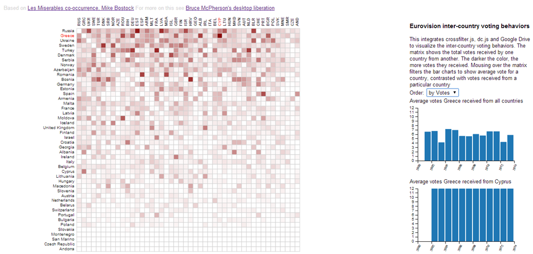
Since the 50’s, there has been an annual song contest involving many European countries. It’s a fairly bizarre event, but one of the most interesting things about it is the voting system. Countries vote for each other’s songs – they can give their top 10 songs 1-8, 10, and 12 points. Most of the time in the contest is taken up with the voting process (although they have streamlined it a bit in the past few years), and it’s fascinating to watch the political landscape in Europe being played out in the voting. For example Greece and Cyprus always give each other maximum points, the Nordic countries always vote for each other, the large Turkish immigrant population in Germany means that Turkey always gets high votes from Germany, which are not really reciprocated.
All this makes a for rich source of visualization data. I had to take the data from a few different places, so there may be a few gaps or inaccuracies. Please let me know on our forum if you find any.
The visualization
Here’s a live visualization.
Screen shot
The darker the intersection between countries, the more votes they give to each other. Hovering over this, along with the bar charts, you can see the cultural anomalies. For example the viz below showed a very dark intersection between Greece and Cyprus. Hovering over that, we can see the average votes Greece received from all countries for each year they made the finals, and we can also see that, regardless of the votes the other countries gave (in theory an indication of the song quality), Cyprus gave Greece maximum votes every year they were allowed to vote
Technologies
Here’s a brief summary of how this was built.
Getting the data
The data comes directly from a google sheet, and the country ISO codes come from a fusion Table. I use Database abstraction with google apps script to pick up the data from both these sources asynchronously as in these snippets.// this is about getting data using GAS data abstraction var uri = "https://script.google.com/macros/s/AKfycbyfapkJpd4UOhiqLOJOGBb11nG4BTru_Bw8bZQ49eQSTfL2vbU/exec"; var source = '?source=xLiberation'; var sheetId = "1kFb83DaRfZNh4OgMmx3owXt283-kbnKBAqiMeigj7KE"; var sheetName = "votes"; var sheetCountries = "isocountries"; var fusionTable ="1GZvkLbmxT6YSrauGQv-_PwRaR_ScUBAdeC2Kychj"; // get initial data var sourcePromise = ajaxGet( uri + source + "&driver=sheet&action=query&siloid=" + sheetName + "&dbid=" + sheetId); var isoPromise = ajaxGet( uri + source + "&driver=fusion&action=query&siloid=" + fusionTable + "&dbid=" + sheetCountries); // when its done we can viz $.when(sourcePromise,isoPromise).done( function (datas,datai) { theViz(datas[0].data,datai[0].data); }) .fail( function (err) { console.log ('Failed to get sourceData from '+sheeName); });
Data manipulation
crossfilter.js was new to me for this visualization. It allows easy filtering of data for the interactive bar charts. I plan to use this heavily in the future.
Charts
dc.js is a library to simplify chart creation using d3.js, combined with crossfilter.js. Although I’m comfortable with d3.js, I found it hard work to get what I wanted from dc.js. The good part is that you get automatic re-rendering when you manipulate the underlying crossfilter dimensions,and a lot of the d3.js busy work for creating charts can be avoided . On the other hand, some basics like grouped barcharts and rotating grid labels are not there natively. Of course, since we are using d3.js underneath, any reformatting you can think of is possible, and with the use of composite charts you can create more complex chart types. However once you start having to use d3 to reformat your charts, you may as well use it from the start. At this stage, I’m not sure if I’ll use this again – there are a number of alternatives such as nvd3 and dimple.js, although I like dc.js conceptually.
Visualization
The main visualization is done with d3.js, and is based on Mike Bostock’s Les Miserables co-occurrence matrix.
The code
<style>
body {font-family:sans-serif;background-color:white;}<br />
.hide { display:none; }<br />
.cell {<br />
stroke: LightGrey;<br />
stroke-width: 1;<br />
}</p>
<p> text.active {<br />
fill: red;<br />
}<br />
aside {<br />
font-size: small;<br />
right: 0;<br />
position: absolute;<br />
width: 300px;<br />
margin-right:40px;<br />
}</p>
<p> svg {<br />
font: 10px sans-serif;<br />
}</p>
<p> .facts {</p>
<p> }<br />
.barchart {</p>
<p> }<br />
.ack {<br />
font-size: .8em;<br />
color:lightgray;<br />
}<br />
</style>
<p>Based on <a href="http://bost.ocks.org/mike/miserables/">Les Miserables co-occurrence, Mike Bostock</a> For more on this see <a href="https://ramblings.mcpher.com/d3-js/eurovision-results-with-crossfilter-and-dc-js/">Bruce McPherson's desktop liberation</a></p>
<aside>
<h3>Eurovision inter-country voting behaviors</h3>
This integrates crossfilter.js, dc.js and Google Drive to visualize the inter-country voting behaviors. The matrix shows the total votes received by one country from another. The darker the color, the more votes they received. Mousing over the matrix
filters the bar charts to show average vote for a country, contrasted with votes received from a particular country
Order:
<select id="order">
<option value="name">by Name</option>
<option value="votes">by Votes</option>
</select>
Average votes received
</aside>
For help and more information join our forum, follow the blog or follow me on Twitter .
See d3.js for more stuff like this.