You may have used the doughnut chart in Excel in order to produce a chart like this
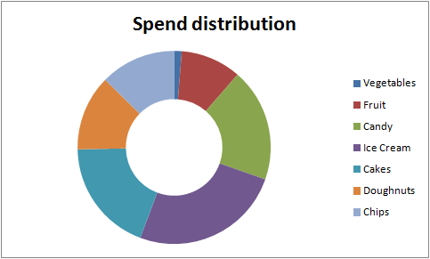
This is fine, but the problem is that the position of any category changes depending on the data. If you are using this to overlay into some story that you rely on the position of the categories being constant, you need to find another representation.
In previous posts I covered heatmaps, and how to make smooth color transitions in charts, amongst other color ramp topics
We can apply the same thing to doughnut charts. Here’s the above chart, this time using a heatmap scheme, and with the categories in a constant position.
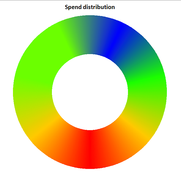
Using the color ramp library, we can show a smooth transition between each of the items. These would be used when it is important the categories take up the same position and are the same size, yet you want to use a doughnut type style. Note that the transition implies a connection between the category items, so you need to carefully order the items and be careful in interpretation. As with all doughnut and pie charts, there may be other charts that are more appropriate. I would use this to illustrate a trend or a focus area, rather than to illustrate exact values. You can of course change the granularity to make the category items discrete if this is more appropriate.
In any case, The code is more or less a one liner.
Public Sub doughnutExample()
    Dim dsout As New cDataSet
    createHotDoughnutChart _
        dsout.populateData(wholeSheet("doughnut"), , , , , , True), "heatmap"
    dsout.tearDown

End Sub
Of course you can tweak the parameters to add multiple categories, and labels
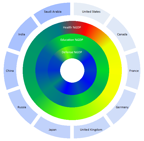
Or change the heatmap properties
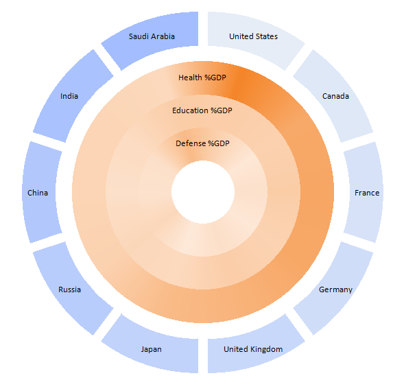
or change the granularity of the heatmap and add value labels

For more detail on this, see the excel liberation site.