What can you learn here?
- ramp color scales
- using in surface charts
- brighten/darken

 Creating Charts with colorRamps
Create a heatmap in Excel showed how to make charts using the heatmap color ramp. Now that we have a generalized Color ramp library it is straightforward to extend the charting to do this too. As usual this code is implemented in the cDataSet.xlsm module downloadable from Download Complete Projects You can also use a color ramp to create shape overlays for Google Maps; see Overlaying circles and heatmaps, or here for simple shapes or maps
Creating charts programmatically
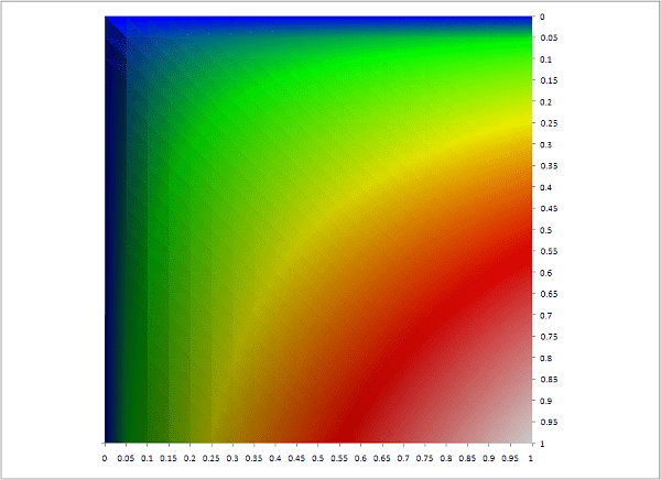
Setting up charts manually doesn’t easily allow for the creation of a smooth transition between colors, but using automation along with a variable color ramp makes the whole thing very simple. Consider this heatmap plot of a function, SIN(SQRT(x*y)/3)
It is simply a 3d surface chart, with 200 categories to give it a smooth transition between colors.It can be created simply using the Data Manipulation Classes and Color ramp library as follows Public Sub colorRampVisualize() Dim dsout As New cDataSet createSurfaceChart _ dsout.populateData(wholeSheet(“crampviz”), , “crampviz”, True, , , True, “y/x”), _ “crampChart”, xlSurfaceTopView, 200, “heatmaptowhite”, FalseEnd Sub We can use a different library entry, in the case a ‘terrain’ ramp, and get this with this code Public Sub colorRampTerrain() Dim dsout As New cDataSet createSurfaceChart _ dsout.populateData(wholeSheet(“crampviz”), , “crampviz”, True, , , True, “y/x”), _ “terrainchart”, xlSurfaceTopView, 200, “terrain”, False, 1.3End Sub Note that I use a ‘brighten’ ratio of 1.3 in this case. I thought that the terrainchart library entry was a bit dark, so you can keep the same ramp but apply a factor to the brightness. The default value is 1meaning – use the library colors as is. You can find the code for the colorramp library in cDataSet download or explained in Color ramp library. See How to create a heatmap doughnut chart for another application of heatmaps to charts.
Creating topographic charts.
I you had a table of longitudes and latitudes against elevation, you could even produce a terrain map. Here’s an example using randomly generated data. And here is the code Public Sub colorRampElevation() Dim dsout As New cDataSet, ds As New cDataSet ‘ the formula data contains rand() function so it will recalculate- Application.Calculate ‘ copy the values elsewhere so it doesnt happen again and change the finished chart ds.populateData(wholeSheet(“elevate”), , , , , , True).bigCommit _ whereIsThis(“straightcopy!a1”), True ‘base on the copied data createSurfaceChart _ dsout.populateData(wholeSheet(“straightcopy”), , “elevate”, True, , , True, “lat/lon”), _ “top”, , 400, “terrainnosea”, False, , False End Sub
Create chart code
This is a ‘souped up’ version of the one already covered in Create a heatmap in Excel Option ExplicitPublic Function createSurfaceChart(ds As cDataSet, n As String, _ Optional xlt As Long = xlSurface, _ Optional targetLegends As Long = 0, _ Optional colorRampName As String = “heatmap”, _ Optional showLegend As Boolean = True, _ Optional brighten As Double = 1, _ Optional showAxis As Boolean = True) As Chart Dim cht As Chart, s As Series, dr As cDataRow, dc As cCell, sc As Double, x As Axis Dim i As Long, red As Long, blue As Long, green As Long, m As Long Dim ax As Axis ‘ clean up previous attempt deleteChart (n) If targetLegends > 0 Then sc = (ds.max) / targetLegends End If ‘add the chart Set cht = Charts.add With cht .name = n For i = .SeriesCollection.Count To 1 Step -1 .SeriesCollection(i).Delete Next i Set x = .Axes(xlValue) If sc > 0 Then x.MajorUnit = sc End If x.HasMajorGridlines = False For i = ds.rows.Count To 1 Step -1 Set dr = ds.rows(i) With .SeriesCollection.NewSeries .name = dr.cell(1).Where .XValues = ds.headingRow.Where.Offset(, 1).Resize(, dr.columns.Count – 1) .values = dr.Where.Offset(, 1).Resize(, dr.Where.columns.Count – 1) End With Next i .ChartType = xlt If Not showAxis Then For i = .Axes.Count To 1 Step -1 .Axes(i).Delete Next i .Floor.ClearFormats End If With .Legend ‘ for some reason legendcount is not ready immediately Application.Wait DateAdd(“s”, 1, Now) For i = 1 To .LegendEntries.Count .LegendEntries(i).LegendKey.Interior.color = _ rampLibraryRGB(colorRampName, 1, .LegendEntries.Count, i, brighten) Next i End With .HasLegend = showLegend End With Set createSurfaceChart = chtEnd FunctionPrivate Function deleteChart(n As String) Dim cht As Chart, i As Long For i = Charts.Count To 1 Step -1 Set cht = Charts(i) If Trim(LCase(cht.name)) = Trim(LCase(n)) Then cht.Delete Exit For End If Next i End Function
Summary
For more tips like this, take a look at Get Started Snippets In the meantime why not join our forum, follow the blog or follow me on twitter to ensure you get updates when they are available. You can also submit anything you want considered for publication, including any nice color ramps you come up, with on this site to our forum. Other related pages to this one are Color ramp library, Create a heatmap in Excel, VBA rgb to htmlRGB, A tagCloud in Outlook, How to create a tag cloud and Data Manipulation Classes
Related pages