A doughnut chart is sometimes used to show relative category shares, like this. Doughnut (and pie) charts have a bad press. It is generally difficult to see relativity between categories, and there is usually a better chart format to use, but in this section we’ll see how to use color rather than size.
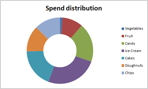
Created from this data.

How to apply a heatmap to the categories
In Color ramp library we cover how to transition smoothly across a color range. With a doughnut chart though, the size is based on the value of the category.
Despite the problems with doughnut charts, careful ordering of the categories, along with the use of color rather than size to show values, can make them a little more attention grabbing. Consider the example below, where we want to show the above data, before and after some action. Note that the ramp implies a connection between its items, so be careful when choosing to use it. 
Multiple categories
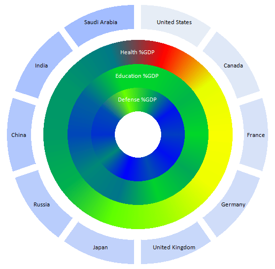
Using color helps to make this kind of chart convey trends and ideas, when interpreted carefully. For example, the chart below shows % expenditure of GDP in various areas by number of countries, and I think it conveys quite an amount of relative high level information.
Here’s how to create a doughnut chart using a color ramp. It’s a one liner, using libraries in cDataSet.xlsm, which you can download here. This example is in the doughnut tab.
What about labels
By default, the doughnut chart is not too good at labeling. However the default usage of this function will add an extra ring and use chart explosions to label. See below for everything on one chart  The color scheme to use for the label ring (and indeed whether to have one) is controlled by optional parameters as below. To find out more about using milestone colors to create sub- color ramps, see Creating one color ramp from another
What about discrete colors for category items
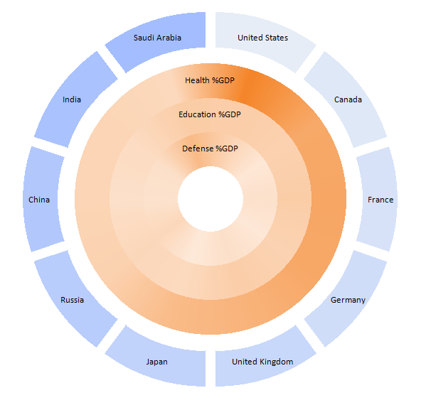
In the examples we’ve looked at so far, there is value in a transition between the various items. However, a colorramp could be taken to imply that there is a connection between the items, and usually there is not. You can therefore, set the ‘granularity’ to 1 and this will create discrete sections for each item. You can also change the colorramp to some other scheme. For example, here is an orange colorramp, with discrete category items, created by this snippet, or you could use a ramp that avoids color blind combinations.
Public Sub doughnutExample()
    Dim dsout As New cDataSet
    createHotDoughnutChart _
        dsout.populateData(wholeSheet("doughnut"), , , , , , True), _
            "heatmap", , 1, "lightorange"
    dsout.tearDown
End Sub

Here’s the same thing with an orange ramp, but a default granularity
Adding datalabels
You can ask for data labels to be added to any of what we’ve looked at so far. Here’s single granularity, using the default heatmap, but also showing value labels, achieved with this snippet. Note that font color is optimized against the background color according to this process.
Public Sub doughnutExample()
    Dim dsout As New cDataSet
    createHotDoughnutChart _
        dsout.populateData(wholeSheet("doughnut"), , , , , , True), _
            "heatmap", , 1, , , , , , , True
    dsout.tearDown
End Sub

Here’s the complete code for the module that creates the chart.
For help and more information join our forum, follow the blog or follow me on Twitter .