In Color Ramps for Google Apps Script I covered how to created heatmaps and other color ramps.
Picking a good contrast font color
One of the problems with a heatmap is that your font color may need to be changed so that it is visible against the chosen color. In fact there are W3 org guidelines for contrast. I apply that algorithm to decide whether to use black or white for the text color. I initially played around with contrasting using HSL and so on, but certain color combinations were just plain ugly, so in the end I settled for flipping between black and white. Here’s the whole section, where a ramp fill color is calculated, and then we use the calculated text color, based on the luminescence of the fill color.
// get the ramp color
var fillColor = new mcpher.colorProps(mcpher.rampLibraryRGB(rampList[l], mn, mx, v)) ;
// set the fill
cacheColor.setValue(fillColor.htmlHex,r,c);
// get a friendly font color for this fill
cacheFontColor.setValue(mcpher.rgbToHTMLHex(fillColor.textColor),r,c);
The supporting code for that is in a shared library, and reproduced below
function w3Luminance (rgbColor) {
// this is based on
// http://en.wikipedia.org/wiki/Luma_(video)

  return (0.2126 * Math.pow((rgbRed(rgbColor)/255),2.2)) +
         (0.7152 * Math.pow((rgbGreen(rgbColor)/255),2.2)) +
         (0.0722 * Math.pow((rgbBlue(rgbColor)/255),2.2)) ;
}
function colorProps() {
  return this;
}
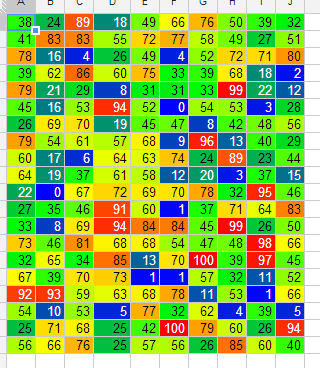
Here’s a heatmap from a Google Spreadsheet, with the both the font colors and the fill calculated as above. For more information see Color Ramps for Google Apps Script