If you have a few add-ons, it’s good to make the Settings a consistent layout and behavior across them. It’s good for the add-on user, since they can go between your add-ons and immediately understand how everything fits together. All my recent add-ons use the same code for their settings, and they all work the same way. The first one took a while to get right, but afterwards it was just a question of configuration using exactly the same code.
Material design
Firstly, I use Material Design in all add-ons. The framework I use is muicss , but there are a few out there and it’s mainly just a question of replacing the class names with the equivalent ones from the framework you are using. muicss is less complete and fancy than some of the others, but it’s very simple to use and what there is seems to be rock solid.
If you’re using muicss, you’ll need these in your project
Getting started
For this post, I’ll use my Dicers add-on, but my other add-ons have exactly the same layout and use the same code.
The root settings screen looks like this
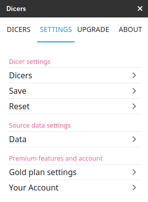
Each of these selectors lead to more screens, and so on recursively.
Elementer
The screens and their behavior are all maintained with an object I call an Elementer. Its purpose is to create all the Dom elements required to present, collect and react to user input. It takes a configuration object which describes the layout you want and generates all the necessary elements and events to take care of the settings. Of course, if you use Angular or Polymer then you probably won’t find this useful, but this all Vanilla JavaScript.
Creating an elementer is simply this, where setup is the object containing the setting configuration.
ns.doElementer = function (setup) {
return new Elementer()
.setMain('')
.setContainer('elementer-content')
.setRoot('elementer-root')
.setLayout(setup.layout)
.setDetail(setup.detail)
.build();
};
The Html is as follows.
Elementer-root is the Div that’s activated when the Settings tab is activated

elementer-content is a div in which the elementer is to be created. Using the .setMain method allows you to set the root of the elementer on a page with other content, but in my add-ons, I always have a dedicated page for the Settings to start upon.
Separation of layout and data
All of the elements managed by the Elementer are kept in a flat structure, even though the layout can be a tree structure of any depth. This means that moving settings from one page to another is simply a layout configuration option. Your code to access the contents of these elements doesn’t need to change regardless of where in the Settings screens your target element appears.
That’s why you see these.
.setLayout(setup.layout)
.setDetail(setup.detail)
Detail describes the elements to be created, and layout describes where to put them.
The layout
Here’s an extract of layout for the first page of settings
pages: {
root: {
label: "Settings menu",
items: ["chartDivider", "behavior", "saveSettings","manageSettings","dataDivider","dataSettings",
"premiumDivider","premiumSettings","accountSettings"]
},
which produces this. You’ll see that each member of items, refers to a row in the settings page.
The items refer to properties of the detail object, which can be actual Dom elements or further pages of settings. Let’s look at a couple.
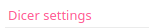
chartDivider:{
label:"Dicer settings",
template:"dividerTemplate"
},
creates this
and
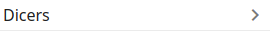
behavior: {
label: "Dicers",
items: ["sortData","autoCreateMax","staggerLeft",
"staggerTop","dicerWidth","dicerHeight","colors",
"resetButton_behavior"],
on:{
enter:function (elementer,branch) {
elementer.getElements().controls.resetButton_behavior.disabled = true;
Process.reserveResetValues (elementer, branch);
},
exit:function (elementer, branch) {
Process.restoreResetValues (Process.control.dicer.elementer , branch);
}
}
},
creates this,
which leads on to a further settings screen, containing its items

And so on. You can see here that some of the items go on to generate actual Dom elements, and the “colors” item, whose layout looks like this
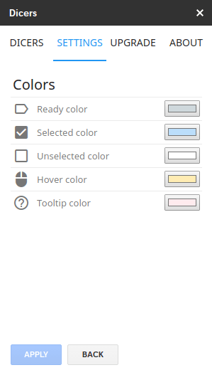
colors: {
label: "Colors",
items: ["quietColor","selectedColor","unselectedColor","hoverColor","tooltipColor","resetButton_colors"],
on:{
enter:function (elementer,branch) {
elementer.getElements().controls.resetButton_colors.disabled = true;
Process.reserveResetValues (elementer, branch);
},
exit:function (elementer, branch) {
Process.restoreResetValues (Process.control.dicer.elementer , branch);
}
}
}
creates yet another screen that looks like this
Navigation is automatically handled by the elementer, and there is the option of allowing it to generate back icons to get back to the previous page, or you can add a specific back button. Since I allow the viewing of the effect of the settings before necessarily applying them, I instead have a specific back button, and an apply button (which becomes active if any changes happen), which commits the changes.
That means that we need to be able to potentially call back some code when a screen is entered or exited. You’ll have noticed the .on property in some of these configurations. I use this same pattern on all my pages to save the current values on entry to that page and to reset them on exit. This simple approach means that the user can flip over to other tabs in the middle of changing settings to see what the changes look like before committing to them with the Apply button.
Of course, both these buttons are automatically generated by the Elementer configuration too. You’ll see “resetButton_colors” is included in the layout item list, and it is defined like this
resetButton_colors:{
template:"resetButtonTemplate"
},
Templates
You’ll have noticed that templates are referred to in some of the configuration detail items. All the usual ones are already set up in the Elementer. It’s the use of these templates that maintains a consistent look to all the settings pages across all the add-ons.
Here’s an example.
resetButtonTemplate:{
tag:"BUTTON",
label:"",
classes:{
element:"action ",
tdElement:"button-item",
tr:"button-place",
cancel:""
},
properties:{
type:"button",
disabled:true
},
styles:{
tdElement:"padding-top:10px;"
},
values:{
property:"innerHTML",
value:"APPLY",
resetable:false
},
custom:{
cancelButton:true,
cancelText:"BACK",
outside:true,
backListener:true
}
},
Any of the template properties can be overridden in the detail of course, as in this example.
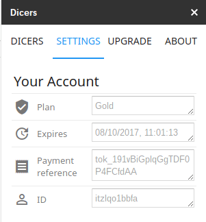
accountPaymentRef: {
template: "wideReadonlyTemplate",
label: "Payment reference",
icon: "receipt",
properties: {
rows:2
}
},
as opposed to the more usual
accountExpiry: {
template: "wideReadonlyTemplate",
label: "Expires",
icon: "update"
},
both of which reference this template
wideReadonlyTemplate: {
tag: "TEXTAREA",
label: "Input text",
icon: "input",
properties: {
disabled:true,
rows:1
},
styles: {
element: "width:150px;"
},
classes:{
elementContainer:"",
element:"mui--text-dark-hint"
},
values: {
property:"value",
value:"",
resetable:false
}
},
and are part of a page that looks like this
Of course, I’ve only scratched the surface of how to use and configure this very useful capability. I used to find the creation and layout of many settings and the management of them throughout the code, the most laborious and error-prone part of any project, but nowadays it’s very quick and easy, is usually right the first time, and of course, it’s very easy to move stuff around as you prototype different layouts.
I’ll be writing this up in more detail in further posts, and of course, the code is on GitHub as usual. In the meantime, if this has piqued your interest and you want a bit of guidance on getting started, then contact me and I’ll see if I can help.
See also Playing around with elementer on CodePen.
- Chord Snip
- Color Arranger
- Debugging Office JavaScript API add-ins
- Dicers
- Dicers Pro and advanced features
- Measure round trip and execution time from add-ons
- Merging slide templates with tabular data
- Office Add-ins – first attempt
- Orchestrating competing google and Office framework loads
- Plotting maps with overlays Sheets add-on starter
- Promise implementation for Apps Script Stripe payments
- Sheets API – Developer Metadata
- SlidesMerge add-on
- Unpicking the Google Picker
- Watching for changes in an Office add-in
- When test add-ons doesn’t work
- Polyfill for Apps Script properties service for the Office JavaScript API
- Sankey Snip