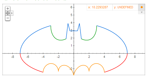
You’ve probably all seen the Batman plot that can be generated by entering a formula into google Search. Their instant graphing capability turns this complex formula into a scatter-plot of 4 series.
Copy this formula into Google Search
2*sqrt((‑abs(abs(x)-1))*abs(3-abs(x))/((abs(x)-1)*(3-abs(x))))*(1+abs(abs(x)-3)/(abs(x)-3))*sqrt(1-(x/7)^2)+(5+0.97*(abs(x-0.5)+abs(x+0.5))-3*(abs(x-0.75)+abs(x+0.75)))*(1+abs(1-abs(x))/(1-abs(x))), (‑3)*sqrt(1-(x/7)^2)*sqrt(abs(abs(x)-4)/(abs(x)-4)), abs(x/2)-0.0913722*x^2-3+sqrt(1-(abs(abs(x)-2)-1)^2), (2.71052+1.5-0.5*abs(x)-1.35526*sqrt(4-(abs(x)-1)^2))*sqrt(abs(abs(x)-1)/(abs(x)-1))+0.9
And you are going to get
I wondered if you could create some kind of an ‘instant plot’ capability of an equation in Excel without using VBA, without needing to create a table of data first, and without having to change the equation from y=f(x) to accommodate cell addresses. As I was working on this , I came across this great informit article by Rob Bovey, Stephen Bullen, and John Green and discovered that they had already solved this general problem. They have created a detailed explanation of how to do it in that article, and I’ve simply used the same approach here. You can find all the examples mentioned here in Downloads in the funnycharts.xlsm workbook.
The batman plot in Excel
For preparation, we need to deconstruct the 4 series in the google formula. I’ve put these in cells b8-b11
| ySeries 1= | 2*SQRT(-ABS(ABS(x)-1)*ABS(3-ABS(x))/((ABS(x)-1)*(3-ABS(x))))*(1+ABS(ABS(x)-3)/(ABS(x)-3))*SQRT(1-(x/7)^2)+(5+0.97*(ABS(x-0.5)+ABS(x+0.5))-3*(ABS(x-0.75)+ABS(x+0.75)))*(1+ABS(1-ABS(x))/(1-ABS(x))) |
| ySeries 2= | (-3)*SQRT(1-(x/7)^2)*SQRT(ABS(ABS(x)-4)/(ABS(x)-4)) |
| ySeries 3= | abs(x/2)-0.0913722*(x^2)-3+sqrt(1-(abs(abs(x)-2)-1)^2) |
| ySeries 4= | (2.71052+(1.5-.5*abs(x))-1.35526*sqrt(4-(abs(x)-1)^2))*sqrt(abs(abs(x)-1)/(abs(x)-1))+0.9 |
Next we need to create some parameters – what is the range of x for the plot? I’ve put these in cells b4-b6
| x from | -7 |
| x to | 7 |
| no of points | 1000 |
Finally, we’ll make a title for the chart, in B7.
| Title | batman |
To create this plot, we’ll need to user array formulas, the old Evaluate function (still present in Excel 2010 .. haven’t tried 2013 yet), and named functions. As described in the source informit article, we need to create a valid chart first, and then tweak the series values. However, since I’ve already created this chart for up to 4 series already, all you would need to do is to tweak the parameters already mentioned. If you need less than 4 series, then just leave the formula blank and change the series line style to no line.
How this works
Excel normally needs a table of data to plot, but we don’t want to actually create a table of data – rather we want to create an array of data on the fly, based on the range of x, and the f(x) equations that generate associated values for y for each series. The x values are generated with this named range (named x).
=batman!$B$4+(ROW(OFFSET(batman!$A$1,0,0,batman!$B$6,1))-1)*(batman!$B$5-batman!$B$4)/(batman!$B$6-1)
This generates an array of 1000 values for x from -7 to 7, starting like this
-7|-6.98598598598599|-6.97197197197197|-6.95795795795796|-6.94394394394394|-6.92992992992993|-6.91591591591592.......
We then need another 4 named ranges, ySeries1..4, which will evaluate, for each value of x, a y based on the equation for each series. This looks like this and uses the old Excel4 evaluate formula. It’s this that applies each value in the array x against the formulas in b8..b11. Here’s an example for ySeries1.
=IFERROR(EVALUATE(batman!$B$8&"+x*0"),"")
a section of the calculated data looks like this.
0|0.252982086068973|0.357591408396655|0.437738550349275|0.505203132591389|0.564550365790257|0.61812277863…..
You will already have created a chart with named ranges for each series. Now we just need to change the named ranges to point to X, Y series 1..4. Of course this is already done in the example, so actually you simply need to enter your formulas and range for x.
And we end up with something not too bad.. not as good as the google one, but it’ll do

Applying the general case
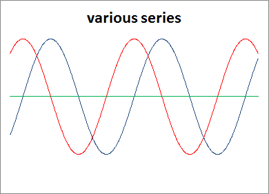
So now we have this chart, we can plot any formulas, for example, these parameters,
| x from | -7 |
| x to | 7 |
| no of points | 50 |
| Titel | various series |
| yseries1= | sin(x) |
| yseries2= | cos(x) |
| yseries3= | |
| yseries4= |
Gives this chart
But let’s stick with some odd charts. How about the well known heart plot in google…
| y= | (SQRT(COS(x))*COS(200 *x)+SQRT(ABS(x))-0.7)*(4-x*x)^0.01 |
| x from | -1.57 |
| x to | 1.57 |
| no of points | 10000 |
| Title | (SQRT(COS(x))*COS(200 *x)+SQRT(ABS(x))-0.7)*(4-x*x)^0.0 |
gives us

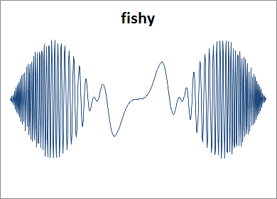
Or this simple one
| x from | -4.7 |
| x to | 4.7 |
| no of points | 700 |
| Title | fishy |
| yseries1= | sin(x^2*2*x)*cos(x) |
Finally, here’s some odd ones for you to try here
If you can, then post the parameters on our forum and I’ll publish them here.