How to create a d3 zoomable partition chart straight from Excel.
As always, acknowledgement to Mike Bostock on whose zoomable partition chart this is based. A partition chart is a way of showong heirarchical data. The zoomable part is the interactivity that is possible using a web based/javascript solution made possible with d3.js . Here we are going to look at how to create such a visualization straight from Excel. There are no dependencies, since the necessary web page html and javascript is created locally on your PC, no cross domain issues, since the data is created right there from your Excel data and embedded in the javascript generated and no need to understand javascript, html or css. If you do wish to customize any of that, they are all held as parameters in an Excel sheet, so you can customize them there too.
The example partition chart.
For this, i am using some data from various sources such as the US census, wikipedia and so on, to create a visualization of where presidents are born by population size, by median income by state. The data is not that important since, the object here is to show how to generate a visualization from some Excel data. The full sized example can be found here.
The data
Hierarchical data is created from the 2 dimensional Excel data – it looks like this
The structure of the data is much like that used in Creating d3.js Tree diagrams, and will look like this.
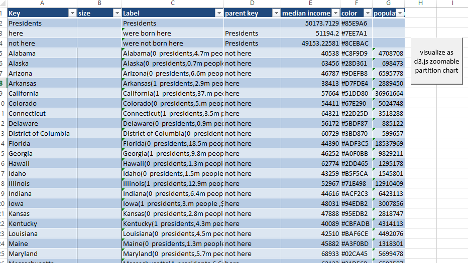
The data is somewhat enhanced in that we are now going to use a size property and a color property.
Size property
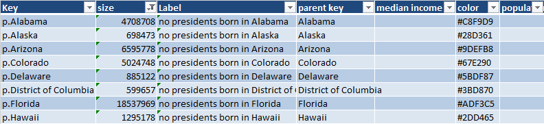
This is used to scale the partitions. It is only necessary in the final child data, since each parent partition is scaled to be the sum of its childrens’ sizes. Final child data looks like this. In this case the size represents the population of the given state.
Color property
The default colors for child and parent partitions are set through style options in the chart parameters, but in this case I wanted to use a color ramp to visualize the median income of each state. I used the Color ramp library to calculate appropriate coloring for each state, using various shades of green as defined by the “greendollar” entry. Here’s an example formula for calculating the color.=IF(E2<>””,rgbToHTMLHex( ramplibraryrgb(“greendollar”,MIN([median income]),MAX([median income]),[@[median income]])),””)
The Code
Much of this is using code and parameters already covered in Color ramp library, Creating d3.js Tree diagrams, Developer information for d3.js force diagrams etc on this site. Specifically for this capability, here is the code required
You can download the example in the cdataset.xlsm workbook from the excel liberation site. The test data is in the d3zoompart worksheet and the options can be set in the d3treeparameters worksheet.
Why not join our forum, follow the blog or follow me on twitter to ensure you get updates when they are available.