When I was writing the Color Fiesta section, I noticed a tweet about something called the Pantone Spring 2013 color collection. I had no idea how pantone worked, so I went off to find out if it was a coding system that could be calculated – turns out it cant, but rather it’s a look out. Since I was making a color table anyway, it seemed like a good set of test data. Turned out that the the mapping is pretty elusive – but I tracked down a large chunk from various scrapings. You can find out more about this at Looking up color table
Alternative ramp layout, Alternative schemes and Ramping color swatches are examples of ramping between members of a color scheme. Here let’s look at a small application that brings together all the components covered so far in Color Fiesta
The target application
Taking a sheet that has all the known data about the Pantone fashion and home color collections over the years – here’s a snippet 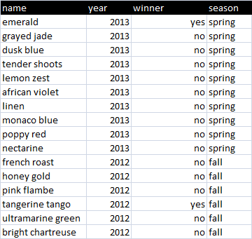 Create a sheet that presents a swatch for each years Pantone colors, a ramp of those colors showing the transition between them, and a summary swatch of each of the colors of the year. The actual colors will be looked up name as described in Looking up color table.
The result
Here’ what we end up with 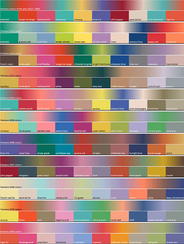
The code
An alternative layout.
Let’s look now at how to make a circular ramp of all that, using code from How to create a heatmap doughnut chart and Alternative ramp layout.
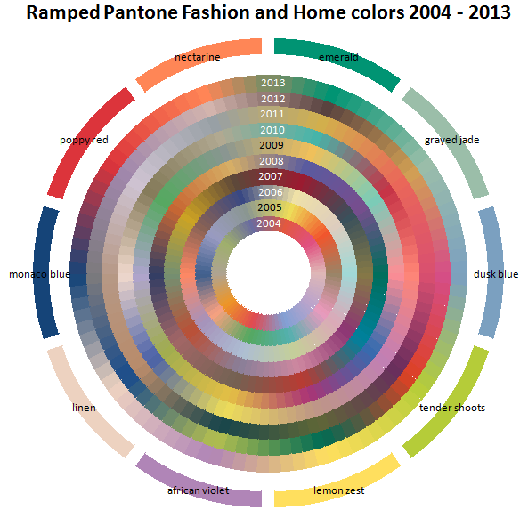
When I first plotted this, I was using a high granularity, meaning that the colors merged round the ramp in the circle smoothly. Trouble was that it looked a bit crazy – so i turned down the granualrity and we have the effect you find in color swatches of lots of little variations in color. I think this looks a little better. The 2013 colors are shown round the outside – the others are the colors of the respective years.
Here’s the code for creating the diagram above.
[pastacode lang=”javascript” manual=”Public%20Sub%20doughnutPantoneExample()%0A%20%20%20%20Dim%20dc%20As%20cCell%2C%20aYear%20As%20Variant%2C%20dsdata%20As%20cDataSet%2C%20dMap%20As%20cDataSet%0A%20%20%20%20%0A%20%20%20%20’%20we’ll%20use%20the%20data%20columns%20to%20create%20an%20array%20of%20color%20ramps%0A%20%20%20%20’%20based%20on%20the%20colors%20for%20each%20year%0A%20%20%20%20Set%20dsdata%20%3D%20getDsQuick(%22pantonedoughnut%22)%0A%20%20%20%20Set%20dMap%20%3D%20getcolorMap()%0A%20%20%20%20%0A%20%20%20%20With%20dsdata%0A%20%20%20%20%20%20%20%20ReDim%20aYear(1%20To%20.columns.count%20-%201)%0A%20%20%20%20%20%20%20%20For%20Each%20dc%20In%20.headings%0A%20%20%20%20%20%20%20%20%20%20%20%20If%20dc.column%20%3C%3E%201%20Then%0A%20%20%20%20%20%20%20%20%20%20%20%20%20%20%20%20aYear(dc.column%20-%201)%20%3D%20getPantoneColorsOfTheYear(dc.value%2C%20%2C%20dMap)%0A%20%20%20%20%20%20%20%20%20%20%20%20End%20If%0A%20%20%20%20%20%20%20%20Next%20dc%0A%20%20%20%20%20%20%20%20%0A%20%20%20%20%20%20%20%20’%20now%20doughnut%20it%20-%20we’re%20going%20to%20use%20the%202013%20color%20ramp%20as%20outside%20labels.%0A%20%20%20%20%20%20%20%20%20%20%20%20createHotDoughnutChart%20_%0A%20%20%20%20%20%20%20%20%20%20%20%20%20%20%20%20dsdata%2C%20%22heatmap%22%2C%20%2C%2010%2C%20aYear%2C%20%2C%20%2C%20_%0A%20%20%20%20%20%20%20%20%20%20%20%20%20%20%20%20getPantoneColorsOfTheYear(2013%2C%20%2C%20dMap)%2C%20%2C%20%2C%20%2C%20False%2C%20vbBlack%0A%20%20%20%20%20%20%20%20.tearDown%0A%20%20%20%20End%20With%0A%20%20%0A%20%20%20%20dMap.tearDown%0AEnd%20Sub” message=”” highlight=”” provider=”manual”/]Sorting the colors
For now I specified the colors in the order they came in the Pantone press release of the time. It would be nice to get the tints lined up with each other so we can see better how color fashion has changed over the year. If I get round to it, I’ll create something to sort colors in some order that bring similar colors together.
For more color topics, see here