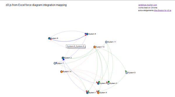
I’ve written about d3.js force diagrams, mapping tweet sentiments, , d3.js trees, Sankey diagrams and various other stuff on the ramblings site all of which show how to create d3.js diagrams directly from simple Excel data. This is settling down now to a standard parametrized capability, so today I’ll show how to apply this to visualize dataflows between items – using an example of system integration visualization. Here’ s the result, with the interactive version here (better with Chrome)
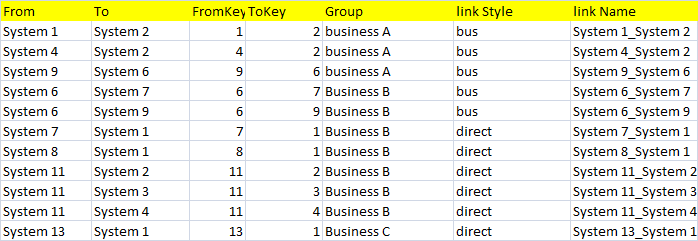
The input data is a straightforward Excel table like this, with the marker styles, colors, link styles and tooltip information all data driven.
To find out how to do this, and download the example workbook, visit the ramblings site.