Here’s the daily visits to the Excel Liberation site over the past couple of years. But what’s that over the past 3 weeks, starting 3rd June ..a 40% sudden increase that seems to be sustaining.
On that day, I published this post about exploring sites using a d3 force visualization, along with this more detailed writeup . So is that causing the extra visits somehow? If visits are coming through that route, then we’d see the ‘direct’ visits increasing. Below is the filter on ‘direct’ source visits – in line with this being the source of the new visits.
Here is the explorer, using site data generated each night using Google Apps Script from the Excel Liberation site.
So I’m getting a lot of visits by visitors double clicking on some of these nodes.
What about other sites?
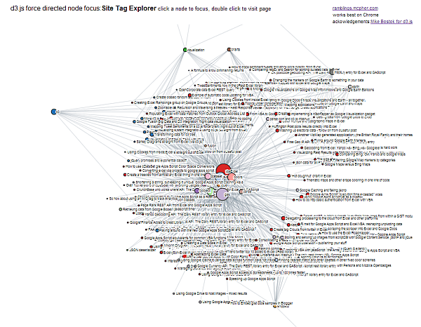
Although there is too much data here (I need to slim down the topics a little), you can of course use the same thing to not only analyze other sites, but also combine sites. One of the benefits of this approach is that you can drive associations between sites. For example this blog has much in common with the Excel Liberation site. You can see it here, this time for this blog . Here’s the screen shot. Too many of these embedded in a blog is a little much.
Let’s combine them
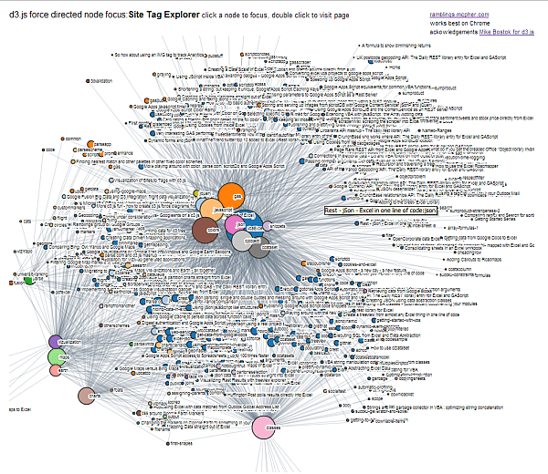
Here’s the two sites combined , and the screen shot below
In a follow up post, I’ll publish the code that generates the data for this visualization if anyone is interested.


